

Posted Date : 21 June 2026
signature reception counter
ray ban | rotterdam
TYPE: Conceptual Exploration
PROJECT LOCATION: Netherlands
FOCUS: Reception
OBJECTIVE: Turn the point of sale into the point of brand contact
VISUALISATION: AI-generated renders
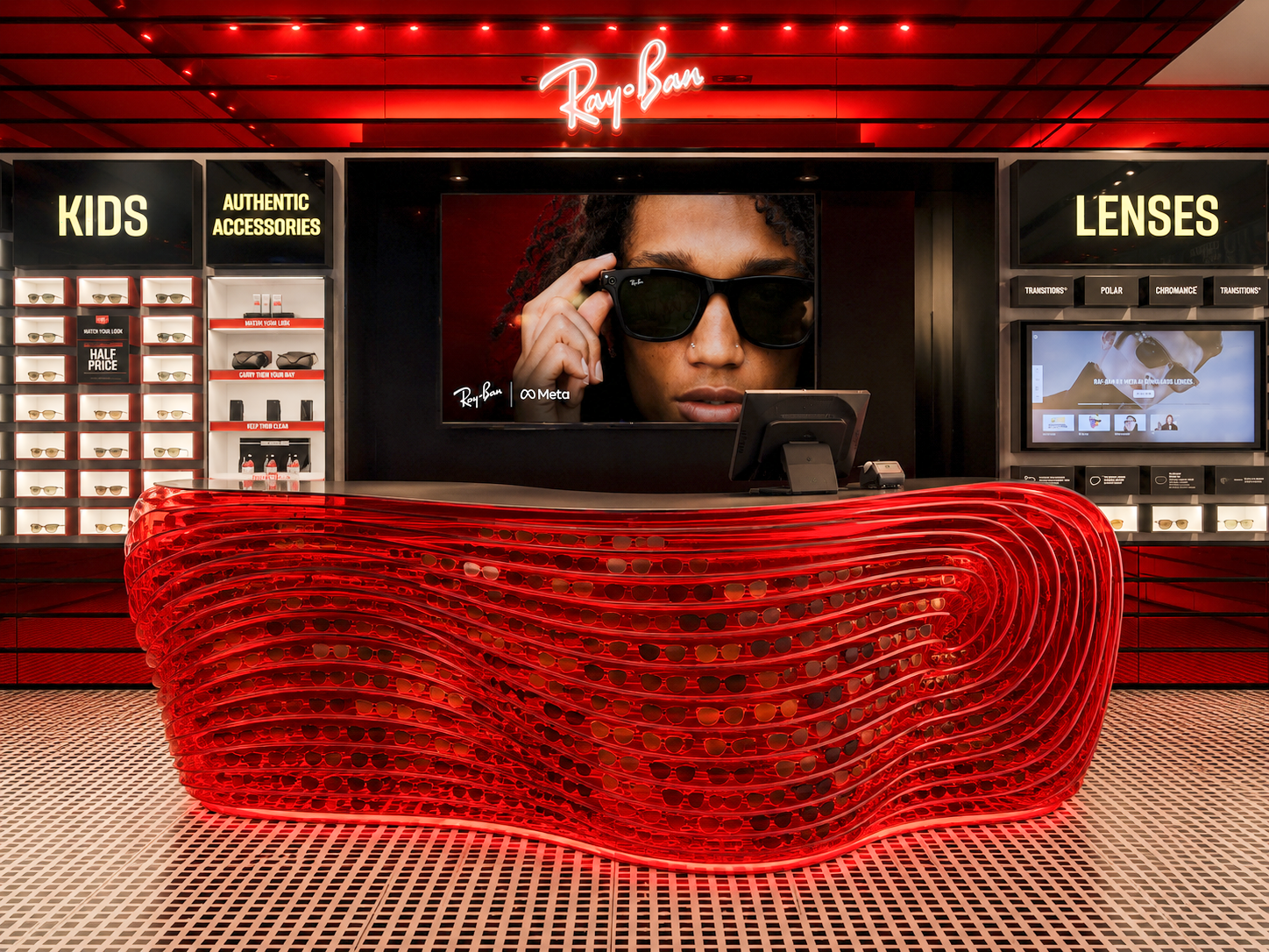
This independent concept study explores how a Reception Counter can become more than a transactional fixture, transforming one of the most overlooked elements within the store into a physical expression of Ray-Ban's identity.
The proposal was developed independently by By Vicky Ong Studio and is not affiliated with or commissioned by Ray-Ban or any related parties.
01 CONCEPTUAL EXPLORATION
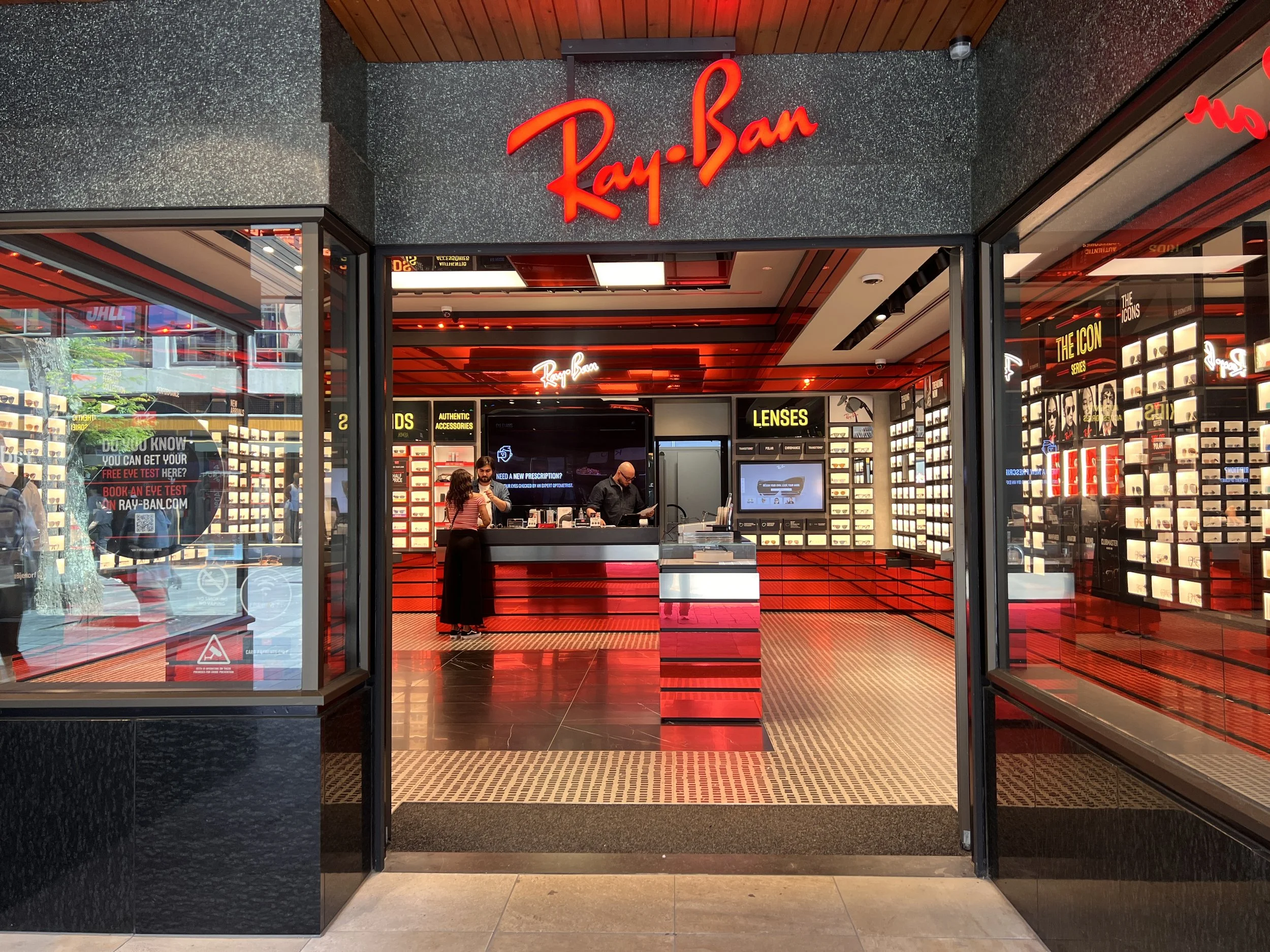
Ray-Ban Rotterdam is a new-generation store. The product wall has presence. The red mirror plinth has presence. The cursive signage overhead has presence.
The reception counter does not.
It is correct. It is also forgettable. Every other surface in the store carries more brand character than the place where the transaction, the conversation, the actual relationship with the customer, happens.
We take our design opportunity to turn the counter from a service point into the store's Signature Feature, the one surface that earns the same attention as the product it sells.
02 THE OPPORTUNITY
BEFORE

03 THE SIGNATURE FEATURE
Ray-Ban's identity is recognised long before the logo appears.
The lens. The contour. The colour. The attitude. These elements have shaped the brand across decades of product evolution.
We took that same language and built it into the counter itself.
04 DESIGN INTENT
“the lens becomes the counter, the counter becomes the brand”

Our intention was to take the single most recognisable shape Ray-Ban owns and translate it directly into architecture. Not a logo on a surface. The surface itself, built from the logic of the product.
We set out to design a counter that is modern in construction but unmistakably reminiscent of classic Ray-Ban: a deliberate collision of new and old, built to hold both the heritage and the present moment of the brand in a single object.
05 CONCEPT EXPLORATION
LENS SKIN. AVIATOR CURVE.
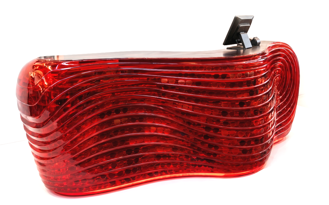
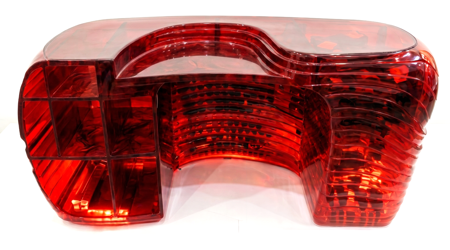
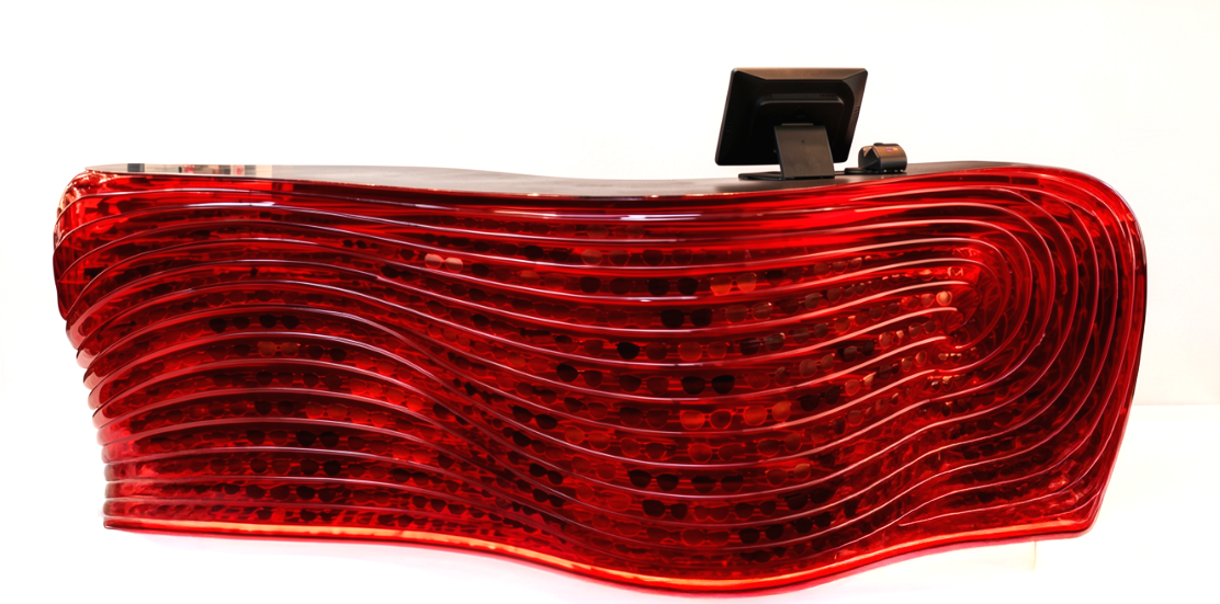
We designed the counter as a single sculptural volume: deep red, high-gloss, built from repeated ribbed bands that trace the same taper as an Aviator lens seen in profile.
The form is intentionally organic. Every other element in the store, the shelving, the lighting grid, the signage, sits on a straight line. The counter does not. It is the one place in the plan where the brand allows itself to bend.
ARCHIVE AT THE COUNTER
The counter top holds the brand's own archive, recessed glass niches displaying heritage models like the original Aviator beside the new collection.
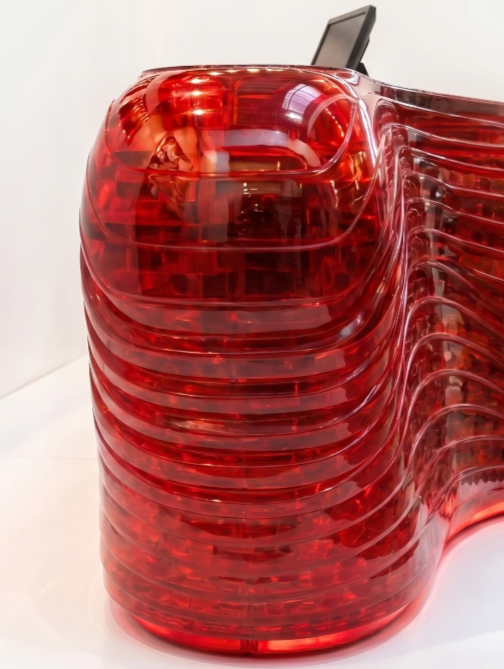
RECYCLED MATERIAL BUILT-UP
Sustainability sits underneath the surface, not on top of it. The ribbed bands are conceived as a recycled-material build-up, layered offcuts and reclaimed acrylic given a second life as the store's most photographed object. Old Ray-Ban material, quite literally, holding up the new collection.
The colour stays red. It is the one constant the brand cannot give up, the same red as the mirror plinth, now extended into the surface customers actually standing at.
06 DESIGN ROLE
“We work from one belief, that a single well-conceived element can transform a space from functional to unforgettable.”
07 THE OUTCOME
We designed a counter that stops being furniture and starts being the brand's signature.
The lens-curve counter repositions the point of sale at Ray-Ban Rotterdam from a service fixture into the store's centerpiece, the surface customers lean on, photograph, and remember as clearly as the sunglasses they came in for.
Creating one feature, telling the whole story.